Use ‘loose’ or ‘floating’ text to save space & create rhythm on crowded pages.
![]()
Zach wrote:
I am lettering my new comic book and was about to make the choice of having the main characters captions being white text in a black filled box. (the reason for this is that he has a pet raven). I remember hearing either you or Richard saying something about being careful of dot gain when using white text in black captions. How thick of a white stroke should I put on the white text to prevent dot gain?
Depends on the paper stock, actually. I’d use .1 for glossy, .2 for matte white and .3 for newsprint. More than about .5 and the letters get too bold, causing the counters to fill in.
There’s another great use for white text on black artwork, and that’s to create “loose”, “floating” or “embedded” captions, which are a great space-saver! Here’s some before & after examples, as lettered by Comicraft:

Above is a page from Spectacular Spider-Man, lettered according to placements provided by writer Howard Mackie (the empty black space was left for the story title). Reading all that text is not only a daunting task for the reader, but it’s covering up the figure of the Green Goblin, who is the subject of most of it! What to do?

Floating some of the captions not only allows them to fit in non-square shapes, it also creates a rhythm, giving the reader obvious places to pause (and breathe!). The main subjects of the text are left uncovered (also thanks to a mask on the Goblin’s hand), and instead the title is placed over Spider-Man, who is still mostly visible beneath.

Here’s a page from Uncanny X-Men lettered according to the placements provided. Once again, caption boxes dominate the page, plus the artist has made it very difficult to tell where the panels are, which makes for a confusing reading order.
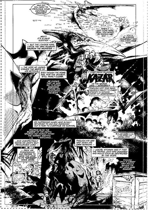
Floating captions to the rescue! All of the important figures are left uncovered (which also preserves the 3D space within the art), and the reading order flows clearly from top to bottom.