It’s true — I designed the Angry Birds logo! And it required very complicated technology: a Sharpie. I shared this step-by-step process with the Lynda.com blog.
As a graphic designer working in the comic-book industry, I’ve created hundreds of logos over the past 20 years: Spider-Man, The X-Men, Daredevil, The Avengers …
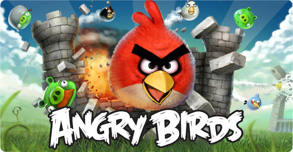
But the most well-known logo I’ve ever designed wasn’t for a comic book at all. It was an unexpected request that came from a couple of Finnish video game designers with a hit app.
And it came together pretty quickly—using a Sharpie and some scratch paper.
Here’s how I designed the Angry Birds logo:
Back in 2010, I got an email from the president of the Rovio video game company. He contacted me through my company, Comicraft, told me they were releasing the next version of their app “Angry Birds,” and asked if I’d like to design the logo.
I’d heard friends talking about the game, but I’d never played it; believe it or not, I didn’t even own a smartphone to play it on.
Their existing logo was typed out in a free font they’d found online and they simply said they wanted something … “better.”
A lot of times when clients aren’t sure what they want, the design process can go on and on as I try to pinpoint exactly what they’re looking for. So I expected this one would take a while.
But I enjoy the opportunity to branch out from the usual comic book work—so I took it on.
I almost always start with pencil sketches. There’s something about brainstorming on a computer that makes ideas look finished before they’re really thought out, while pencil and paper lets me erase and be a lot freer with my ideas.
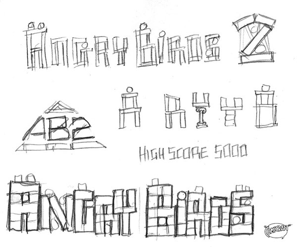
I downloaded screen snaps of the game and started sketching logos based on the bricks and blocks pictured in the game. I thought it was a pretty clever solution, but I always provide a few options. So I sketched some comic-booky logos, too, with jagged ends, bursts, and drop shadows:
The strange thing—OK, one of the many strange things—about working in comic books is that clients from outside the industry come to us looking for something “comicy,” while comic-book creators and publishers often want something serious and typographic: “like a movie poster.”
The Rovio guys loved the “comicy” options, and asked me to keep going in that direction. This is usually when I go to the computer, choose some of my fonts and start re-creating my sketches in Illustrator.
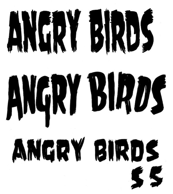
I tried two fonts called Monster Mash and Battle Damaged:
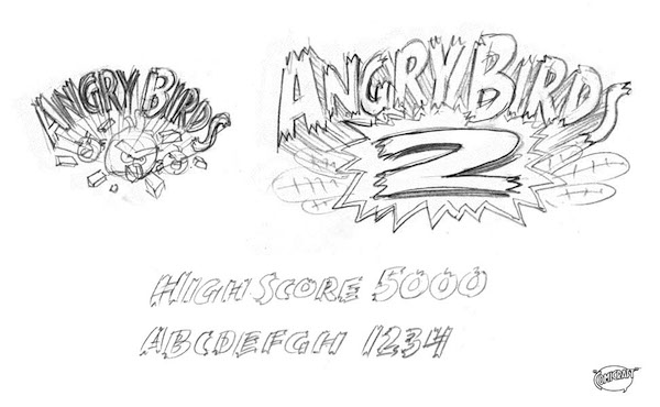
But they seemed a little stiff for this job, so I went back to pen and paper and drew some ragged-looking logos with different pens:
Then I scanned and autotraced them, adding “comicy” outlines and drop shadows:
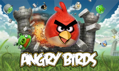
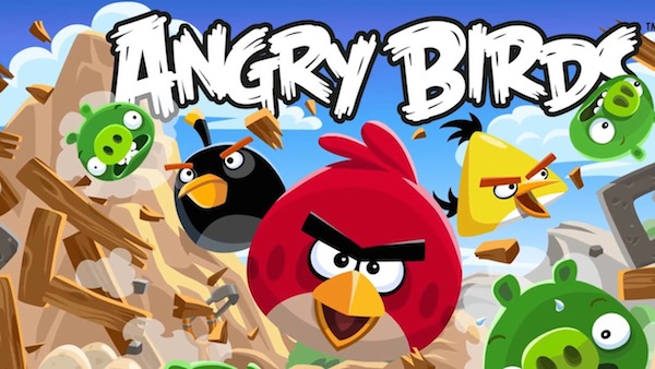
I also mocked them up over images from the game, so the clients could see how these logos looked in context:
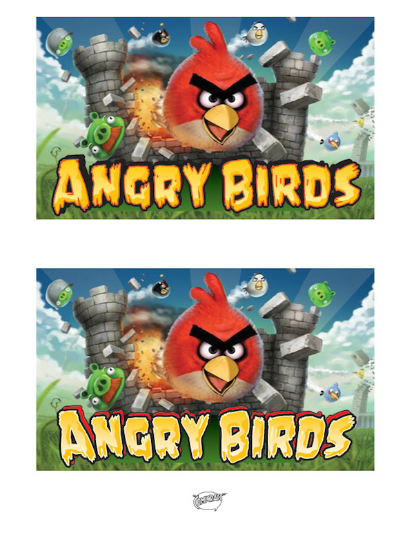
Alas … I’d gone too far. They said, “We like the direction, but we don’t want too big of a change from the current logo.” They had decided to drop the “2″ from the game title and were going to just market it as an upgrade from the current one.
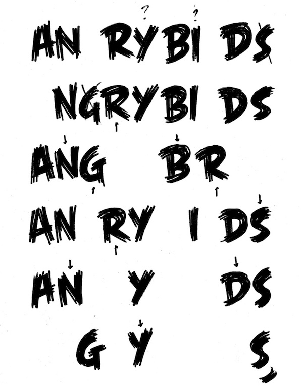
So I went back and looked at their original logo again.
It had a ragged, lively feel that suited the game (I did my research by playing on a friend’s phone). But the way the letters overlapped made it difficult to read, and I thought a larger first letter in each word would create a more recognizable silhouette.
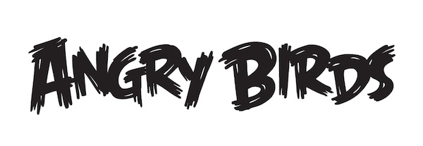
I got out a Sharpie and a stack of printer paper, and focused on developing each letter until I had at least one of each that I liked. I drew quickly, without thinking too hard. I didn’t want to have to tweak them much on the computer; with brush-type lettering, too much fussing sucks the life right out of them.
After choosing my favorites, I scanned the pages, autotraced them in Illustrator, and assembled the letters into a rough logo.
Here, my comic-book lettering skills came in handy: When drawing a sound effect (like WHAP! or BRAKKADOOM!), I want the word to appear like an object coming at you from the source of the sound. It needs to be bouncy and lively, but also easy to read.
The trick is to find the best way for the letters to overlap so that the word becomes a single object—but each letter is still immediately recognizable. I never want the reader to have to stop and decipher it, or else the story that’s been coming alive in their minds will grind to a halt.
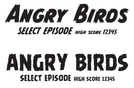
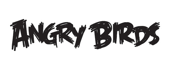
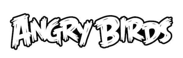
They asked me to remove some of the white gaps in the pen strokes, smooth out the curves, and make the ends cleaner and sharper. Here’s the cleaned-up version. Can you see the slight differences?
They then asked for a white fill with a black outline. I gave them this:
And that was it. We were done.
I was shocked, assuming they’d want shadows and gradients to make it look more like a 3D object. I wasn’t convinced it was snazzy enough for a hit video game, so I rendered this version and dropped it over the other logo just to see how it would look:
But it wasn’t as good. Simple worked better.
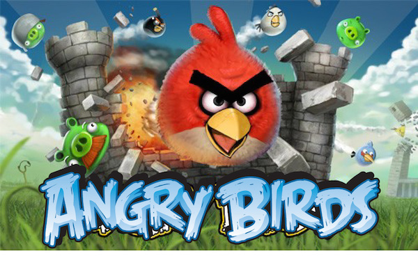
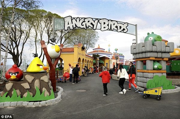
To this day, they’ve only used the logo one way: plain white with a black outline. It’s worked on everything from candy and toys to theme-park entrances.
The more logos I design, the more I realize that, for every job, the perfect logo is out there waiting to be found. My job is not so much to create it, as to discover it.
I can never predict if it will take one step or 100 to get there, but when you land on the one that’s right, it’s just … right.
Angry Birds logo and images copyright © Rovio