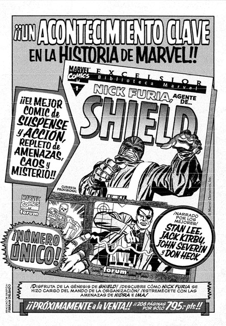
Lettering artist Ferran Delgado painstakingly recreates Marvel title pages of yore for the Spanish editions of Marvel Comics. Here we present some of Ferran’s fantastic title pages, along with his thoughts on the lettering process, and the answers to a series of questions he posed to us.

Ferran on Lettering:
I am a letterer — among other things — and I work in Spain. For years I have adapted many title pages and logos made by Richard and Comicraft, and it was a pleasure to get access to his EPS files and learn about Comicraft methods by analyzing his studio’s work long before he explained it with full detail on this web site.
I did the work you see here five years ago, more or less. I thought I was walking alone in the desert while doing it. My editor made feel like they were saving my life by letting me to do all that work. And they thought I was crazy by making all that great effort at exchange of very few money — my editor didn’t care about comics and he couldn’t understand my interest to respect the original look. Sometimes I retouched the letter’s corners with rapidograph to simulate the drop of the ink at the beginning and the end of the stroke of a pen. And I had to draw some parts that letters didn’t cover of the drawing. Some samples are fully made by rapidograph after manipulating some alphabets.
But I enjoyed while I did them. At that time I worked like I was the reader, and I tried to offer what I would expect as a consumer. And I was happy with that.
When I was younger, I got angry when I did compare the Spanish edition with the original, and I swore that if I got professional, I would fight against that mess, and I would try to get as close as possible the graphic translation. And I am proud to say that all this time I worked very hard with that thought in mind. Against all odds.
I have a clear conscience that I did what I could. Sometimes it worked well, sometimes not so well. But I fought so hard as I could.

But right now, while I’m very far from Marvel comics, I get the recognition now. In fact, I left that publisher tired of feeling frustrated and impotent. I couldn’t watch any more how the boss’s friends got all that work and ruined it. And I got awfully paid works while showing I could do better work than the others. It was too frustrating. I had to leave.
I was very sad when I had to quit work with Marvel comics. Because I was happy working with that material, and because I did know they would do a mess with it. Right now it’s hard for me to take a look at that old comics lettered with modern fonts that doesn’t fit. But I couldn’t bear that working conditions anymore. The price was too high.
It is also hard for me right now to watch modern Essentials printed with that low resolution. It’s outrageous!
Right now I don’t work with the comics I grew up with, but I have discovered a new world like manga, and I can do a very good living lettering at $5/page! Of course, I have to letter more than a thousand pages per month with the help of one assistant!
I think that Richard Starkings and his team — let’s not forget terrific JG! — are among the most relevant letterers in comics, like Sam Rosen, Artie Simek, John Constanza, Jim Novak and Tom Orzechowski.

I am very grateful to Richard and John because they opened a new universe of possibilities to explore, when they took risks by investing time and effort to apply computers to lettering. They showed me new ways and took away the hardest part of lettering, and took all that effort to redirect it to explore new limits. Also, I think that, along with computer coloring, Comicraft made comics look more modern, and helped them adapt to this new age and make them still attractive to new generations. I remember when I began to get bored about lettering by hand and its limitations. Also I remember that it was a little difficult for me to adapt to computer lettering. But right now, I think this change is refreshing, and it has made me recover my excitement about lettering!
Sometimes I hear people that complain about computer lettering, because they say that is “too perfect”, or it has too much “computer look”. I think that Richard disabled all that kind of arguments with his incredible work in WILDCATS. I think it was a perfect mix between both worlds (hand-made and computer), and it fit perfectly with the artwork. Also, I think that Richard’s work with STEAMPUNK was impressive! It showed that lettering could reach limits that never anyone could imagine. Thanks to Comicraft, lettering’s role in comics is much more important now than before.
Also, I hear people that complain about “old” letterers losing their jobs because of this new way to work. I think there is room for everybody, and letterers that couldn’t adapt to new ways still get jobs as classical artists. I think that it is necessary to make a very wide spectrum of comics and reach as much people as possible to keep this industry alive.
Ferran interviews Richard:

Ferran Delgado: When did you begin to think about founding a company?
Richard Starkings: I never really thought about creating a company as much as getting some help. At some point I realized that running a comic book production department was a task with which I’d already grown familiar at Marvel UK, so hiring able and enthusiastic Comicraftsmen and training them was little more than a continuation of that same responsibility; the only real difference was juggling the finances involved, and I still find that difficult today!
FD: How did you deal with having people work for you?
RS: Not always very well! Over the years there’s been a lot of shouting, a lot of people coming and going, a lot of late nights and one or two bounced checks… As I’m sure there are in any business, big or small. I’ve read THE IDIOT’S GUIDE TO MANAGING PEOPLE and tried my best… with varying degrees of success. At least four of Comicraft’s alumni continue to work in comics to this day — three of them constituted the entire lettering division of Crossgen comics where they undoubtedly enjoyed the benefits a bigger company can offer them, like a human resources department, a personnel officer and weekends… Hmmm, I wonder if they’re hiring — what, they’re out of business?!?

FD: Were you worried about being a businessman, because it could separate you from your work, and get you absorbed with company affairs that have nothing to do with your talent?
RS: Yes and No… It’s always important to be a businessman, whether you work alone or with assistants. The business of business can be just as creative as the business of commercial art, and has allowed us to develop comicbookfonts.com, Hip Flask and our forthcoming line of books, all of which offer even greater opportunities for creativity than I ever had before.
FD: Do you miss the times you had no responsibilities, and just had to letter some comics each month by hand?
RS: Yes and No… I do miss the days when I lived in Venice Beach and would letter four or five pages and then go and watch the waves crash on the shore, but I wouldn’t give up the fulfillment that comes from working with talents like Ladronn, John Roshell, J. Scott Campbell and Kurt Busiek. Everyday offers new excitement and new challenges.

FD: Were you scared to death when your company began to grow because of all the responsibility?
RS: At one point we were lettering over 60 books a month and I had 17 employees on the payroll. At that point, it was difficult to manage all the deadlines, the personalities — and the personality conflicts. Luckily, the industry itself contracted and we dropped back down to less than ten employees, which is just about within the scope of my capabilities.
FD: How did you deal with giving away total control of your creations, and trusting other people to make work under your signature?
RS: I didn’t give away control… Comicraftsmen like JG and Dave Lanphear and Wes Abbott seized control! On
ce you’ve taught people the methods and practices it’s your responsibility to trust them to do a good job. I like to believe that our reputation is built on the fact that I give the guys in the studio a large degree of freedom, rather than because I stamp my personality over every piece of work. The quality of the fonts created by JG — Mr Fontastic himself — plays a large part in the consistency of our work, and I’ve always lettered pretty much all the title pages in the books we letter myself.
FD: How much quality were you willing to sacrifice in favor of quantity of work?
RS: None. One of the biggest compliments I was ever paid was when pen lettering artist Jim Novak told me that he found it difficult to tell if I was doing all the work myself — because the quality was so consistently high.

FD: Do you fear that someone you taught could create his own company?
RS: I don’t really have to fear that any more, because some seven or eight years ago one of the guys working for me did in fact strike a deal with one of Comicraft’s clients and took thousands of dollars of work away from us overnight. He worked as a letterer for some time, but his work never grew beyond the choices offered to him by the handful of fonts bought for him (from comicbookfonts.com) by his employers. Furthermore, we’re now lettering more books for that same company than we were before they chose to circumvent us. Why? Because instead of acting out of bitterness and resentment, I chose instead to raise the quality of my studio’s work, and we went on to create more fonts of greater variety so that writers and artists would seek us out… Which they did and still do.
FD: Do you fear that the companies will eventually letter all their comics inhouse?
RS: I don’t really have to fear that any more either… Because Marvel and DC Comics DO letter books inhouse. However, I was always aware that this might one day be a possibility and built as broad a base for the business as possible. When I started lettering comics in America fourteen years ago, work provided to me by Marvel Comics represented more than 90% of my income… A few years ago Marvel represented 50% of Comicraft’s income… Today they represent less than 5% of the company’s income… And we’re still going strong!

FD: You say that at the beginning, you just wanted get help because you were exhausted. My question is: how did get the strength to start all this new project if you were out of gas? Did you have a break to take breath and recharge batteries? Or you had to sacrifice many things to extract energies to survive the experience?
RS: I am a buddhist and one of the central points of buddhist philosophy is that of Hon Nin Myo — from this moment on. Buddhism encourages you to live each day as if it is the first day of your life, even if it’s the last day. It was difficult to rebuild my career in America after five years at Marvel Comics in England, but I found the energy in my determination to not settle for second best, to always push myself to do better. That attitude attracted better work and a higher profile demanded more from me. Water finds its own level.
FD: I suppose you must have a very strong will to believe in your possibilities in that early steps when some people say to you that you wouldn’t succed… How did people around you react with this emerging project when it was just like that, a “project”? Did they believe in you? Did you get support?
RS: There was a LOT of resistance at the beginning. I was often told that computer lettering would never catch on. Now, of course, it’s in every comic book you see, and there are days when it seems that we were mugged and the thieves got away with our wallets, but, as I’ve said before, the pioneer is always the man lying flat on his face in the desert, pointing the way, with arrows in his back!
FD: Right now, when you are a busy businessman with publishing projects, do you still enjoy lettering a comic book? Or do you feel that you need to distribute your energies thinking “big” and lettering is too much effort?
RS: I DO still enjoy lettering — most recently I lettered HIP FLASK: MYSTERY CITY, GUNPOWDER GIORL & THE OUTLAW SQUAW, SOLSTICE and BALLAST for our own line, Active Images. It’s still fun to be the first person to read a book, and to make a contribution that influences how the book is read. Lettering is very much a performance — how you place balloons, emphasize words, overlap captions plays a big part in the telling of a story and I still appreciate the importance of good lettering. You can also see my work in CONAN, WILDSIDERZ, REVELATIONS and WALLACE AND GROMIT as well as any book written by Jeph Loeb, still one of our biggest fans and supporters!
FD: Do you see yourself one day thinking that you are tired to push you till your limits, stop, and enjoy what you get? Or do you think you always will create new creative goals?
RS: You MUST always push yourself BEYOND your own limits or life is hardly worth living. Even standing still is backsliding. When you learn to enjoy the challenges life throws at you, you know you’ve already won.
One Reply to “Lettering Showcase: Ferran Delgado”
Comments are closed.