A discussion on Comic Lettering with Lee Nordling, Al Davison, Richard Starkings, Todd Klein, Kurt Busiek, Marv Wolfman, Michael T. Gilbert, Batton Lash, Bob Ingersoll, Bill Knapp, Malcolm Bourne, Steve Leialoha, Leonard Kirk, Howard Cruse, Steven Grant & Bryan Talbot.
Lee: Hildy Meznik, the editor of the Disney books at Marvel decreed that balloons could not cross panel borders. As a writer, I could deal with it... but as an editor, I like using that technique quite a bit.

Bob: On those few occasions when I've done stories plot-first, I found placing balloons across panels to be an invaluable tool to make up for bad storytelling by the artist. If the artist's layout design doesn't tell the readers' eyes where to go next, a balloon or sound effect which crosses the border into the next panel can move that eye to where it should go next. I always hated those little arrows that directed you to the next panel, because they made the fact that the artist hadn't done his or her job obvious. But using word balloons or sound effects to move the eye instead of arrows is less intrusive, because it incorporates arrow's equivalent into the actual art and story elements.
Al: Art Young, editor on the Vertigo book TAINTED that I did with Jamie Delano, wouldn't allow captions or balloons to cross panel borders. When we asked "what, not even if it improves the flow of the page?" he just responded "it's my 'prejudice' and I'm keeping it, whether it works or not!"
Marv: That's what I like. Never let the facts interfere with opinions. BTW, I like Art - he's a good guy. But he's dead wrong here. Personal prejudices should not be imposed on others.
Al: Yeah I got on real well with him otherwise, good to work with... apart from that one point, nice guy... he openly admitted it was a prejudice but was determined to impose it on the books he edited.
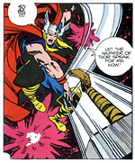
Steve Leialoha: Roy Thomas always wanted the word balloons on the panel borders whenever possible. No floating balloons. My favorite dictum of his was that Conan doesn't think: no thought balloons for him.
Kurt: I think Roy's definition of "whenever possible" may have been fairly loose. I just grabbed the nearest Thomas written/edited comic to hand -- GIANT-SIZE SUPER-VILLAIN TEAM-UP #1, as it happens, which is about as straightforward as it gets: Roy, John Buscema, Joe Sinnott and Artie Simek -- there's a floating caption on the splash, six floating captions on the 2-3 spread, three floating balloons on p.4, another on p.5, another on p.6 ... Shooter would have moved them all, plus others that touch or overlap panel borders, but nonetheless aren't at the top or the bottom of the panel. The panels wouldn't have looked as good, but they'd have followed his rules...

I always liked Len Wein's dictum that he explained to me in 1983: Balloons at the top of the panel should butt to the border, if possible, balloons at the bottom of the panel should float. They're balloons, they're full of air, they do that! That's the sensibility that works the best for me.
Of course, as pencillers leave less room for balloons, and as electronic lettering brings about production changes, it's not always possible to do that -- plus, when the writer rattles on enough to fill all available space, you also run out of choices.

No thought balloons for Conan was a narrative choice more than anything else. Whenever Conan's thoughts needed to be related, they went into the narrative captions, which added to the pulp feel. There, Roy was specifically trying to evoke a tone based on a heavy prose narrative, and for the most part it worked well. Plus, he'd had those years writing the Vision, in AVENGERS, and he didn't get thought balloons either, except for a couple of times that were apparently enough to convince him it didn't work for the character.
Marv: I don't believe there should be any rules as to where the balloons should be. They should flow with the art and be placed to lead the reader from one balloon to the next. But, when possible, but not every panel, if I anchor a balloon to the top of a page, I eliminate the top border line so the white of the balloon blends with the white of the space between panel borders. These days I don't do it nearly as often because people color within that space. I prefer more white space as well as pages that don't always 'bleed' off the page. I think white space adds to the art so when you do a bleed it has more impact. I also prefer white panel borders so the page doesn't look like a jumble of color where everything blends into everything else. We need rest space and we need the panels to read better. Color everywhere prevents that.
I never used thought balloons for Dracula because I didn't believe you should ever know what he was thinking. You should only judge him from what he said and did, and since what he said was very often a lie that, to me, said more about who he was than anything else. This is why I completely disagree with first person captions from Batman. We should learn about him through what he says and does and not what he thinks. On the other hand, I have no problem with first person captions from Superman because there is no hidden side to him. He is what he says. As for balloons that go over panels, I do them to help lead the reader in the right order when the art is unclear or the panels are stacked weirdly. As I said, I don't believe in any rules in storytelling. You do what works and you change your approach depending on the situation. Stupid rules create boxes that inhibit creativity.
Bill Knapp: White space on a page has a purpose, exactly as you described, and to fill it all in with black, I think, tends to wear the reader out. The black isn't the negative "resting" space, it makes you take in the whole page at one time, instead of panel to panel the way you're supposed to.
Lee: I like Len's "rule" of thumb, except for the floating analogy, which is cute, but it hardly explains why a balloon butted to the bottom border doesn't work as well as floaters in that region. For those who like to speculate, I suspect it's because a balloon butted to the bottom would tend to draw the reader's eye down, rather than across the page.
To the other dialogue/thought balloon discussion, I didn't like writing thought balloons for Mickey Mouse, because I was writing him as a pulp action hero/problem solver, and I didn't want to reveal how he was solving problems until after he'd done it.
Rich: I'm of the opinion that balloons butted to the bottom of a panel border often flatten the shot, and remind you that you're "looking in." It's like a fly walking down the bottom of the lens of a camera during a film-- when it's in the air, it's part of the movie's world -- when it lands on the lens it's part of your world.
Bryan Talbot: To return to the general theme, whilst we all love the "comic-booky" stuff ourselves and know that it's part of our storytelling vocabulary, to the general, non-comic book reading public these things are clich�d and even childish. This is the audience we want to break into if the medium is going to survive. Superhero and Manga fans take them on board, yes. They are all part of the look. But if you're telling a story that's in a genre where these are inappropriate and is aimed at a mainstream readership, they are a turn-off, a distancing device, to your intended audience. And if the pictures can say exactly what they need to without them, they're absolutely redundant. Hogarth, Hokusai, Arthur Rackham -- add your own favourites here -- didn't need them to convey exactly what they wanted.
Text is another matter. I feel that many comic writers (usually - as opposed to writer/artists), especially Vertigo writers, don't think that they've done their job properly unless you can hear the writer's voice in every panel. If the picture can carry it, they're not only superfluous but vacuous as a result.
As an aside, I'd say that "thinks" balloons, SFX, wobble lines (or "agitrons"), whoosh marks etc *are* totally appropriate to humour strips when they fit perfectly well into a funny style.
Bill Knapp: This is an area that raises a lot of questions to me, actually. In general I try not to use sound effects, or to at least limit their use, but there are definitely times when it is necessary. A close up of a gun going off, especially is there is some sort of dialogue with it, needs the sound effect. Otherwise you "hear" someone deliver a line, but there is no "BANG" to accompany it, so does the gun actually go off or is everyone using silencers? I've been wrestling with this on the book I'm working on and generally go with the effect when faced by this question, but generally try to keep their use to a minimum. I've had a couple times where a gun goes off off-panel. If there is no effect, how would I get across the shot?
Malcolm Bourne: I guess the point we are all making or reflecting on is that in the medium of comics, all aspects of our creative roles are a part of the finished whole and all have an influence on how that is perceived by the reader. As a writer, I will certainly throw out suggestions for the letterer where it feels relevant and use things like balloon shapes or letter size or even balloon placement, as far as I am competent to judge all that, for the effects I want to create. MUCH AS IT WOULD HAVE A SIMILAR EFFECT HERE!!! The history of use of all capitals is, I guess, about their being easier to read especially back in the days of poorer printing. What has happened over the years, maybe, is that the all caps style has been associated with "dumbed down" or "not sophisticated enough".... hence some editors want certain things to portray that sophistication, other for their own philosophies for other reasons e.g. a house style.
Leonard Kirk: I HATE how frikkin' eliteist some of these schmucks are getting. Sure, there are times where sound effects and thought balloons may not help telling the story but that doesn't mean you have to toss them out altogether. That's bullshit.
Having said that, it does bother me when a writer tosses in a sound effect for a panel that, when said aloud, doesn't sound at all like how it should sound. A scene I drew in JSA showed a character squishing a remnant of the Ultra-Humanite's brain under his foot. I think the sound affect, as written, was something like KKRRKT!
While I haven't stepped on too many brains in my life, I have to say that I don't think it would sound like that. Brains are soft, wet and smushy. I suggested replacing it with SPLTCH! Though surely not the high point of my career, I was quite happy when the writers and the editor agreed with me.
Balloon and sound effect placement has ticked me off as well sometimes. I make a point, whenever I'm working from a full script, to ALWAYS fax copies of my pages to the editor with all of the balloon and sfx placements marked. It bothers me that this also seems to be a dying tradition as more and more artists just pass the buck onto the editors.
Bryan: I agree. I *always* send full lettering placement guides and colour guides with the finished artwork -- unless I'm doing it myself of course. The placement of speech balloons, SFX and colouring is an integral part of the storytelling.
Kurt: Regarding panel borders, it's all a matter of effect, I think. If you want that heavy, oppressive feel, black in the gutters can work very well. We wound up doing it for a few scenes in JLA/AVENGERS, and it really added to the mood.
I think it's all just craft -- all the different approaches to lettering people have talked about are all appropriate in the right context. Big lettering, small lettering, fancy on some jobs, resolutely plain on others -- crossing the borders opens up a page and moves the eye, staying in the borders has more reserve, more restraint.
Pages with no gutters, where the panels just bunk up against each other bug me, as do pages that bleed in all directions all the time, regardless of what's in the panels -- I find that they both make the art seem cramped and claustrophobic and jittery. But then, there are times when that's the effect you want, so it's another tool in the tool chest...
Sometimes I do jobs with no sound effects or thought balloons; Sometimes no captions. But I like to have the option to choose what's best for the story I'm telling and the approach of the artist I'm working with, rather than company-wide rules that don't accommodate different styles and intents.
There'll be no thought balloons in my CONAN adaptations. As Marv noted about Batman and Dracula, Conan's one of those guys who it's good to see act, and not get into his head too much. Batman is too reserved, Dracula's too mysterious, and Conan's too primal to articulate his thoughts too much. He shouldn't be that easy to "read."
We're not taking quite the same approach to the narrative captions, but if I need to get into Conan's head, and I can't imply it though the visuals and dialogue, I'll do it with captions, in a pulp-narrative manner.
As for placements -- I try to do all the placements myself, on much the same grounds -- though I'm not an artist.
Even when working with experienced artists, I try to see the layouts on a full-script job -- and often have to ask for alterations because there's no way to balloon the panels well. The few times a penciller has placed the balloons on a job of mine, they've too often been placed wherever the penciller thinks they'll fit, whether it means putting them in places where they'll be read out of order, or overlapping a caption from the bottom of panel 1 into panel 4, and so on.
Bob: How times change. In the "olden" days -- like when I started out reading, the norm was the script-first style. At that time, spotting balloons was considered to be part of the artist's job. He or she had the full script and knew exactly how many words would be required, so he or she was expected to spot the balloons, so that he or she could design the page around them.
Steve Bissette told me that when he was doing SWAMP THING and he'd use a lot of unusual layouts, he'd always spot the balloons first. That way he could arrange the balloons so that the eye moved from balloon to balloon naturally, and he could design an unusual layout that still managed to tell a story.
Steve: I've seen pencilled pages from the 50's where it was standard procedure for the penciller to actually letter the thing even though it would go to the letterer next. I have an old ('53) Toth page like that. I was at a con in the mid 80's that had a comics contest/critique sort of thing, with the "pros" assessing tryout pages from the young hopefuls. They had all been give a brief Marvel style plot with no script. Alex Toth was there and had agreed to be in on it but when he saw that there was no lettering on any of the pages he said the whole thing was totally unprofessional, that it was wrong to learn to learn to do comics like that and he left. I could see Mr. Cranky-Pants point, though the rest of us went on in a slightly more instructional vein...

Howard Cruse: It was like pulling teeth to get most (not all) of my students at the School of Visual Arts to take seriously the notion that planning ahead for balloon positioning was integral to creating a comic book page. They had all absorbed the "doing it the Marvel way" as an excuse to ignore the whole issue. Unless I nagged them relentlessly they would end up with cramped, tiny lettering squeezed awkwardly in whatever nooks and crannies were available between the expansive panoramas of swinging fists. For me, balloon placement is integral to the design process. I see no problem, however, in letting them (or elbows or sound effects, for that matter) cross panel borders and gutters. I like tying the full-page compositions together that way. Long, uninterrupted horizontal and vertical lines get monotonous fast, at least in my current aesthetic. (Which is not to say I can't be a feverish admirer or artists who are strict about their grids, as were some of my favorite comics creators of all times like the Little Lulu team of the fifties.
I also enjoy violating strict rules of three-dimensionality that undercut any pretense that a panel is a "window" through which readers are peering. Often, for example, a balloon will be positioned "behind" a character's head while nonetheless extending "in front" of the panel's edge even though the character is theoretically "behind" that edge. In other words, just as the presentational theatre style, in contrast to more "realistic" styles, acknowledges and uses the fact that the actors in a make-believe world are actually in the same room as audience members who can be addressed directly when circumstances make it dramatically useful, the comics I create intentionally remind readers frequently that they are ink lines on a flat piece of paper and that the "real" action is taking place in the imaginations of those readers with the ink lines serving as a guide and stimulus.
It was a big step for me when I said good-bye to exclamations at the end of every sentence. I was increasingly aware of the syntactical absurdity of the practice early in Wendel's six-year run, but I stuck with them throughout out of sentiment for an old comics tradition plus a disinclination to change styles in the middle of a series. With Stuck Rubber Baby I made the break.
I'm not ready to give them up with sound effects, though — especially with loud ones that are inherently sharply plosive and hence emphatic. I can't logically defend an exclamation after a "Sniff!" I'll admit, but even there I'm not quite ready to give ground. There are conventions in comics that have no parallel in written literature but are nonetheless expressive. I would put bold-facing as an indicator of vocal inflection (not importance of content) in that category. In a dialogue-dependent medium, having that extra tool to help indicate what an actor would do with aural inflection on the stage is not something I'm willing to sacrifice just because the tool is not used by text-only writers.
On the other hand, the notion of always boldfacing "Batman" or "Superman" regardless of inflection, as DC always used to do (I haven't checked lately to see if the practice persists), struck me as arbitrary and stupid even when I was eight.
I think its good for all of us to use or forego specialized comics tools according to our taste and sense of what's appropriate at a given moment in a story. To have rules like "Balloons should always be at the top" offends me as would any global proclamation about how artists should go about expressing themselves.
Steven Grant: Overuse of SFX just clutters up the page. My general rule of thumb these days is not to add SFX to actions visible on the page, since reader imagination can add sound just as well, and I doubt most readers need to know what a punch or a gunshot sounds like; I suspect most SFX along those lines actually hinder reader appreciation by limiting the "recognized sound" to what's expressed by the SFX. On the other hand, off-panel actions often need SFX to make them understandable, particularly if characters on-panel are reacting to the sounds. (A gunshot's a good example here as well; several characters turn apprehensively toward the sound of an off-panel gunshot.) Wherever an SFX is necessary to make the meaning apparent, it should be used. Wherever it's redundant to the action in the panel, it should be avoided.
My other favorite use of SFX, also not to be overused, is to have dialogue as SFX erupting out of a speech balloon for effect, to add extra special emphasis.

Rich: I teach students and Comicraftsmen that lettering sits on two dimensional planes — like panes of glass — which might be in front of, or behind, the speaker or speakers. We show examples of panels from SPIDER-MAN: CHAPTER ONE -- written, drawn and lettered by John Byrne -- that show characters breaking this 2 dimensional space. The effect, I think you'll agree, is a flattening of the image, or, as Jim Shooter would say, the characters objectify the balloons.
Nevertheless, I'm all in favor of students considering ideas that are in opposition to my own. I'm not one for exclamation marks at the end of sound effects, but Tim Sale insists on them, and contradicts me on this in his piece in our book.
Howard: I appreciate your point of view even though I have come to a different conclusion. I haven't seen the John Byrne panel you use as an example, but I would argue that only mediocre drawing will make a drawing flat. If another artist wants to be concerned about 3-D consistency in a 2-D medium, I can honor his or her desire to make that a point of concern, and I myself dislike visual inconsistency when it's the result of sloppiness. But as I said to the group, I personally feel that there's something to be gained by subtly reminding readers that we're all in the business of suspending belief and letting ink lines on flat paper guide us into another world of the imagination where crosshatching is translated into real light and shade, magenta and yellow dots -- with maybe some cyan thrown in -- turn into flesh that has feelings, and motionless icons become flowing mixtures of light and sound. But I'm still evolving and may someday even be embarrassed into lettering a gun's BANG without an exclamation point.
![]()
The conversation above took place online over the course of a week on the e-mail group Panel2Panel. I'm always keen to stimulate conversations like these -- any comment that sparks a consideration of the importance of good lettering, created by a professional and thoughtful letterer, raises creator's awareness of the role of the comic book letterer.
Many writers and artists say "Yeah, Yeah, lettering is important," but if they don't hear the arguments for and against, they can easily dismiss it or accept bad lettering as a matter of course.
— Richard Starkings
<& ../../footer.mas, topic => $topic &>