![]() Title pages can be a lot of fun. each title should seek to capture the essence of the story and the character (or characters) featured therein. Take a look at the four treatments of the title "A Clash of Titans" shown below. Notice how each treatment responds to the style and conventions of the books for which they are tailored. These conventions are usually established by The 'Mood' of the Book, The Style of the Art and The Suggestive Nature of the Story Title itself.
Title pages can be a lot of fun. each title should seek to capture the essence of the story and the character (or characters) featured therein. Take a look at the four treatments of the title "A Clash of Titans" shown below. Notice how each treatment responds to the style and conventions of the books for which they are tailored. These conventions are usually established by The 'Mood' of the Book, The Style of the Art and The Suggestive Nature of the Story Title itself.
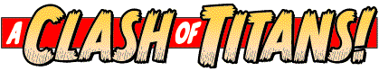
![]() his title, for SPIDER-MAN, was created using Comicraft's MonsterMash font which
we modelled in the style of Marvel's JOURNEY INTO MYSTERY logo. The letters have been "frayed" at the bottom with the pen tool, an effect sometimes called "Roach Chew,". The words "A" & "OF" are set in a font designed by Dave Gibbons, a big fan of Artie Simek and Sam Rosen who lettered Spidey in the sixties and brought to the book a warm humanity which was probably as much a product of "Dreaded Deadline Doom" as it was a reaction to Stan Lee's avuncular editorial style.
his title, for SPIDER-MAN, was created using Comicraft's MonsterMash font which
we modelled in the style of Marvel's JOURNEY INTO MYSTERY logo. The letters have been "frayed" at the bottom with the pen tool, an effect sometimes called "Roach Chew,". The words "A" & "OF" are set in a font designed by Dave Gibbons, a big fan of Artie Simek and Sam Rosen who lettered Spidey in the sixties and brought to the book a warm humanity which was probably as much a product of "Dreaded Deadline Doom" as it was a reaction to Stan Lee's avuncular editorial style.
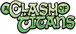
![]() UPERBOY has always had a very distinctive flavor: Sharkmen, Female Wrestlers, Walking Trees, Dinosaurs, a "World's Collides" crossover and a couple of hundred girls in bikinis. Add 'em up and if you're not thinking of the B-Movie posters pasted on the walls of every fifties diner you've ever been in, then you've uh... never been in one! The SUPERBOY title below was created -- by 'hand' - with the pen tool and seeks to bring to mind B-Movie posters in general and the work of designer Saul Bass, in particular.
UPERBOY has always had a very distinctive flavor: Sharkmen, Female Wrestlers, Walking Trees, Dinosaurs, a "World's Collides" crossover and a couple of hundred girls in bikinis. Add 'em up and if you're not thinking of the B-Movie posters pasted on the walls of every fifties diner you've ever been in, then you've uh... never been in one! The SUPERBOY title below was created -- by 'hand' - with the pen tool and seeks to bring to mind B-Movie posters in general and the work of designer Saul Bass, in particular.

 |
|
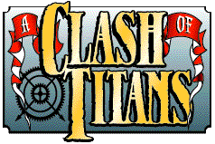
As with all the title treatments shown here, the words "A" and "OF" are pushed back and played down, thereby high-lighting the main sense of the piece -- "Titans Clash!"
|
|
 |
|
In keeping with the book's Industrial Gothic flavor, the lettering of 'A' and 'OF' feature the kind of fussy serifs you might find on the letterhead of an Antiquarian. The overwrought letters for 'CLASH' and 'TITANS' are weathered and bronzed to suggest aging metals and steam-driven engines. The plaque and ribbons are typical of turn of the century British commercial design. Gor, Blimey! 'Ope ya live ta forty-one! |
|
Next: ELC in three easy steps
<& ../../footer.mas, topic => $topic &>